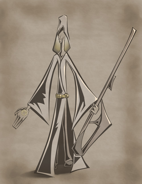
Priest
Light and Shadow

When working with the highlights and shadows, I wanted to give a nod to past comic books. I noticed many of them used solid black instead of blending the shadows into the colors. It was due to my observation I used solid shapes in my shading.
One difference though was I did not use a solid black for the shadows. As shadows are rarely black, I gave the shadows a sephia tone and let some of the color behind the shadow come through.
When shading I gave some space between the shadows and lines. This was to keep the lines separate from the shadows, and to give the image some rim light.
For the highlights I wanted to keep them to a minimum as I didn't see many highlights in the old comic books. The highlights I used were to bring out and give a little more volume in a few locations.
Continue to the next step
