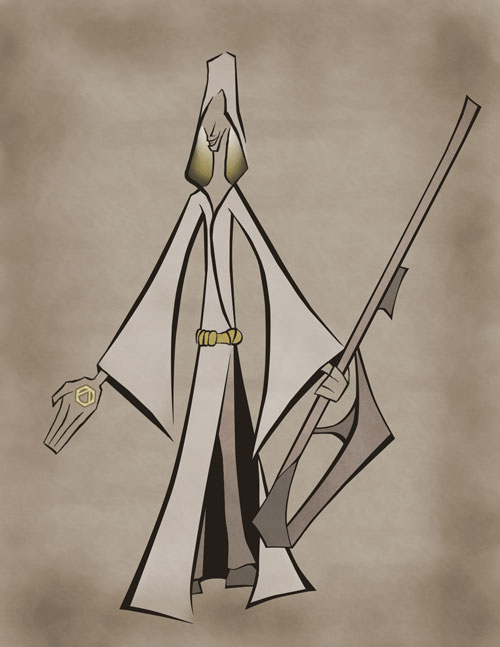
Priest
Color

For the color I wanted a sepia tone to create an older feel to the art. The different shades between the dark and light become important when working with similar, muted colors.
The other aspect I used with the sepia tone was to pick one other bright color. This color then stands out and can be used to pull your eye to certain locations. I decided yellow would work well for the Priest.
Continue to the next step
what CONCEPT will you DESIGN?
